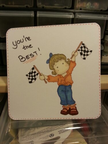
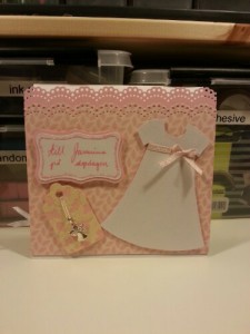
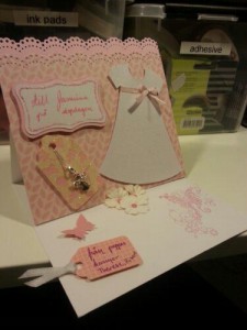
I was a bit crafty today and managed to create a couple of cards all with a valentine’s theme, so odd this time of the year, he he.
I tried a lot of different and, to me, new techniques with masking and coloring using spray. And I used my new flexmarkers to color a bunch of stamps. That’s always a lot of fun, and it’s even funnier now when I’ve reorganized them a bit to make the access easier. I do love my promarker wallets but I find them handy for travelling or when I have a huge space to color, which I rarely have of course. I’ve spent most of my day by my closet now and I still have a lot of inspiration left although I’m getting exhausted so I might just relax for the rest of today.

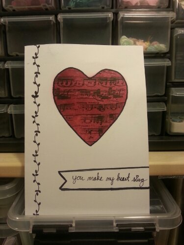
This card is that one card where nothing goes your way. The masking ruins the stamping because it’s a tiny bit higher than the card, it also ruins the coloring since it’s not properly adhered, my bad I know. After coloring and stamping you notice two things, the tape is too sticky and leaves marks and the heart is not centered even though you tried to make sure it was, which leaves the left side empty. Since it was supposed to be a one layer card I’m left with few options and I found a decent stamp. And of course I get ink on my fat fingers and leaves black marks here and there (it was possible to remove them enough to barely see them, phew). Stressed by the ink marks the stamping went bad (at least for a perfectionist).
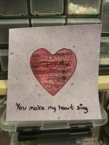
With most of the mistakes covered I jump in to writing my sentiment and it’s leaning.. and I decide to try to cover it up with my planned fake banner and I manage to draw a very leaning line, leaning in the other direction than the text of course and the bottom line was decent of course. So I have to draw thicker lines, miss the thin line and have to make a shadowy look to cover that up. After all these mistakes I’m surprisingly satisfied, it does look quite OK or I’m just too lazy to make a third round (Yes the purple card below was supposed to be the first one and then I remembered I had to have white space on the card for the LIM challenge).


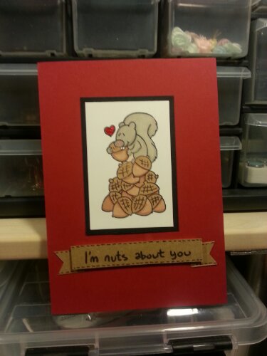
I love this stamp, it’s super cute! I seem to love stamps with funny animals easier than others (I have another favourite with a moose on, adorable!). I made it for the 2 sisters challenge this week.

