The Christmas cards of 2013

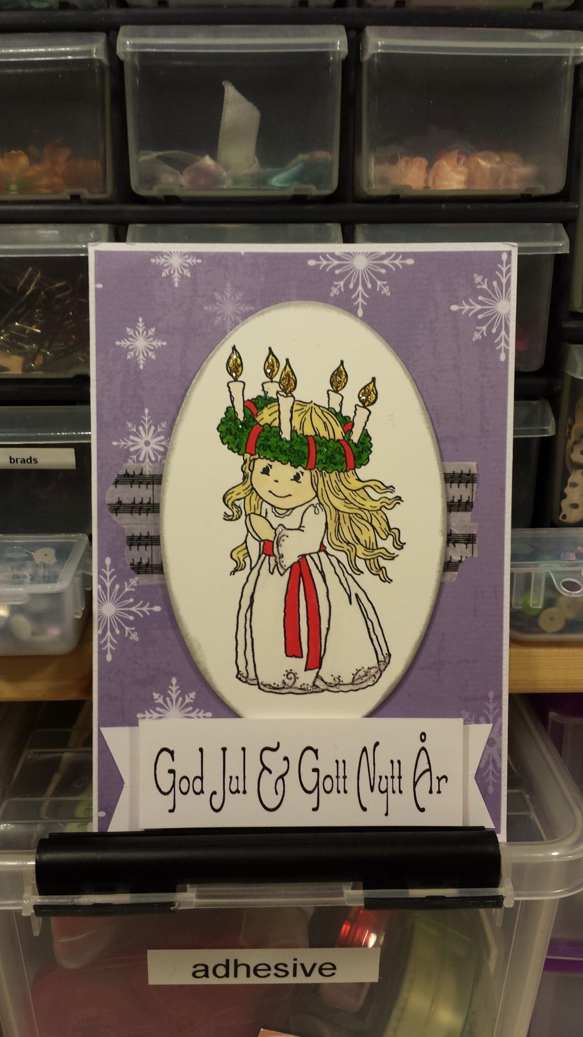
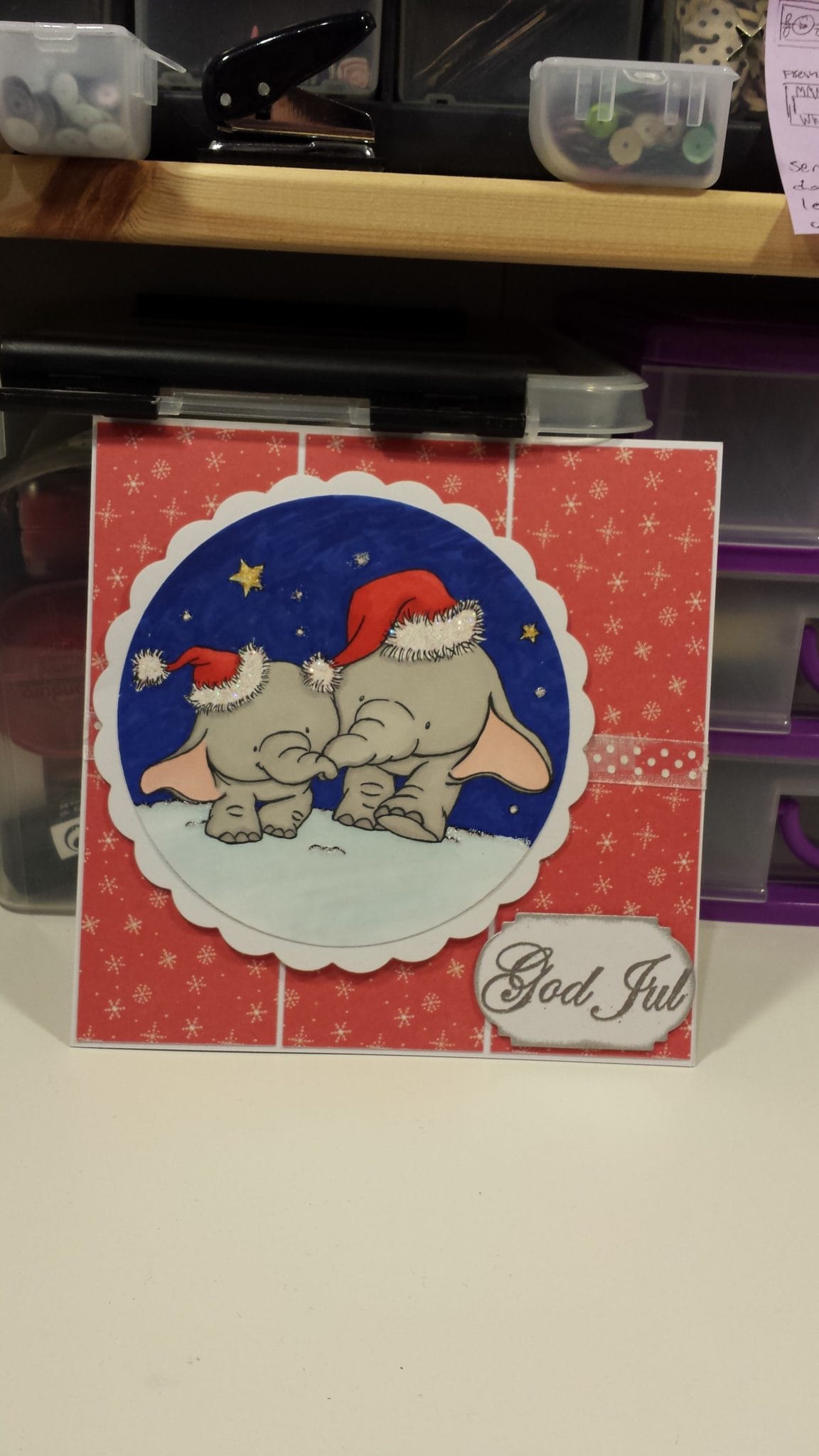
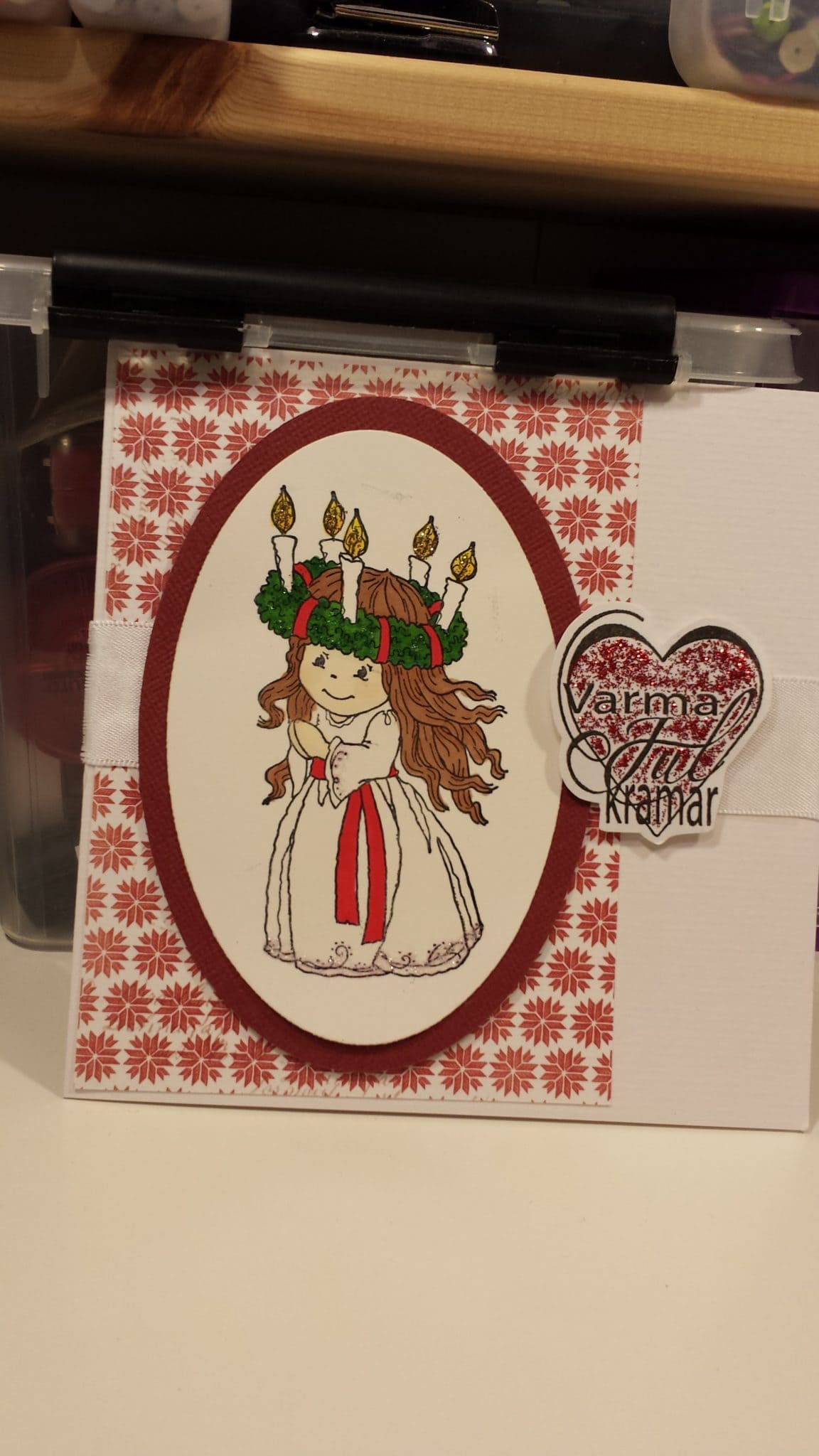
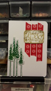
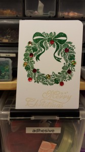
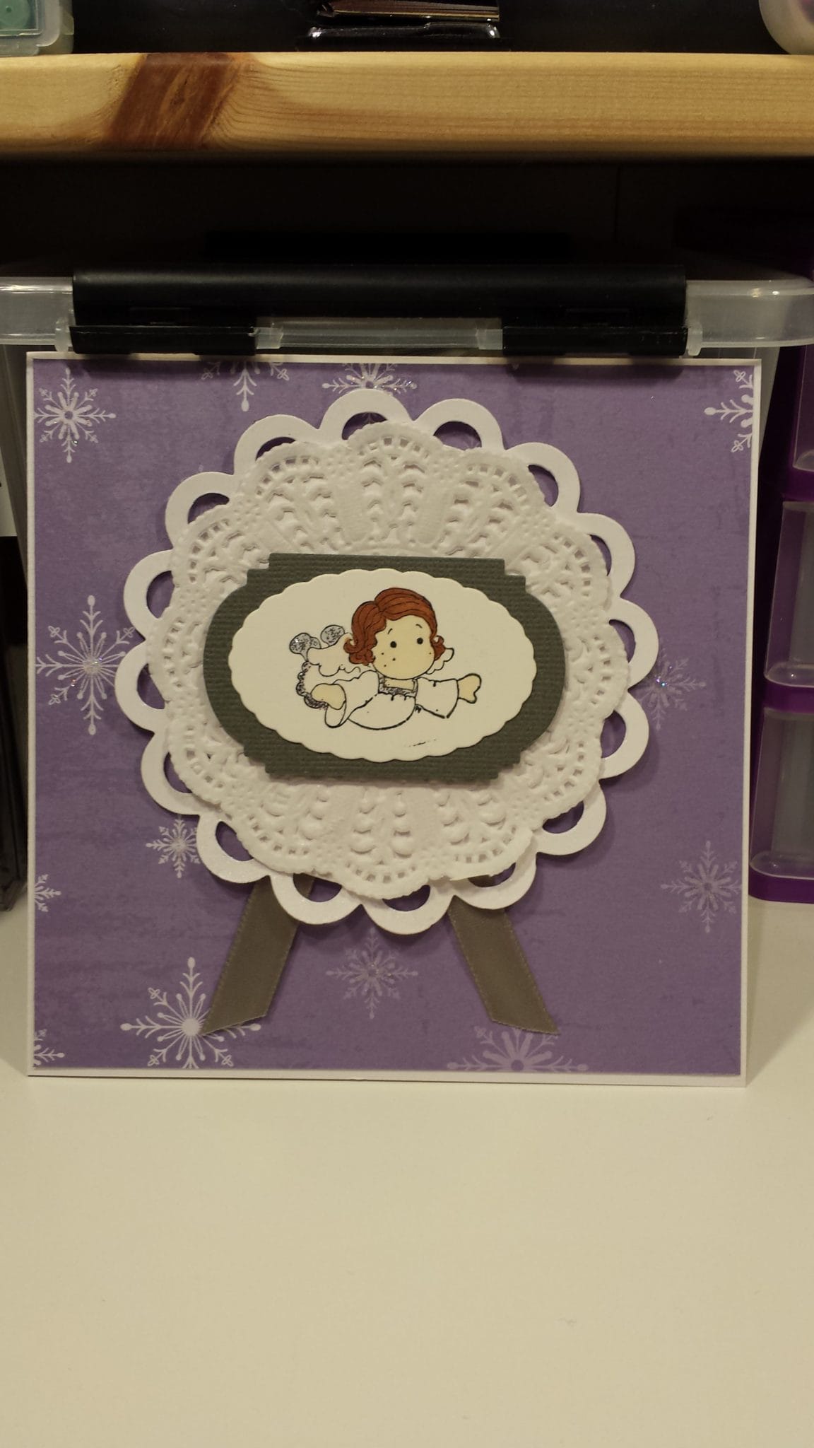
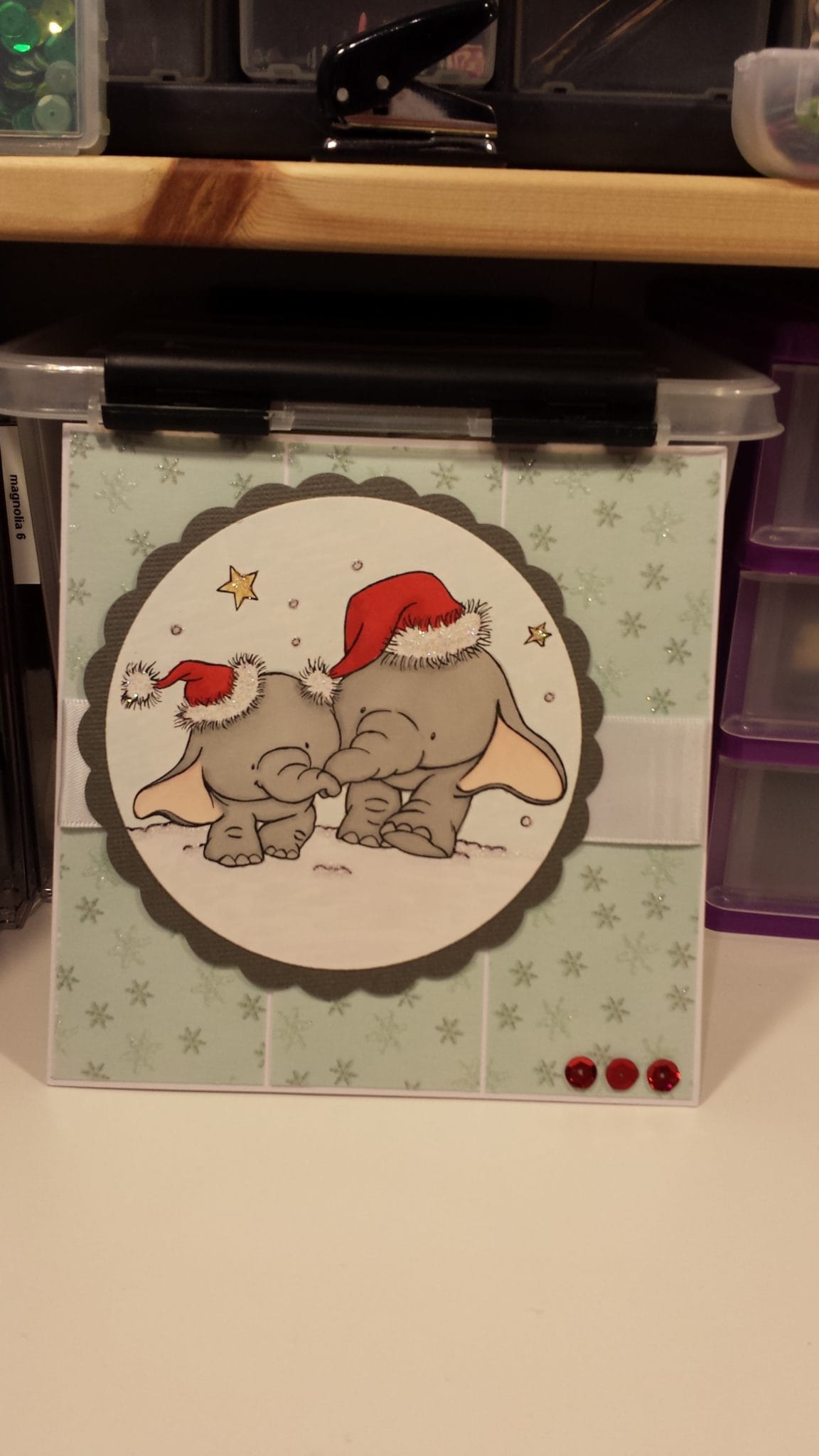
So I finally managed to finish my cards for this Christmas, they are supposed to be mailed tomorrow at latest but I might just do that on Tuesday instead, depends on how much time I have tomorrow since I didn’t manage to write the addresses.

I’m going to make this post a quick one as I’m really tired after this weekend filled with candy and card making among other things.

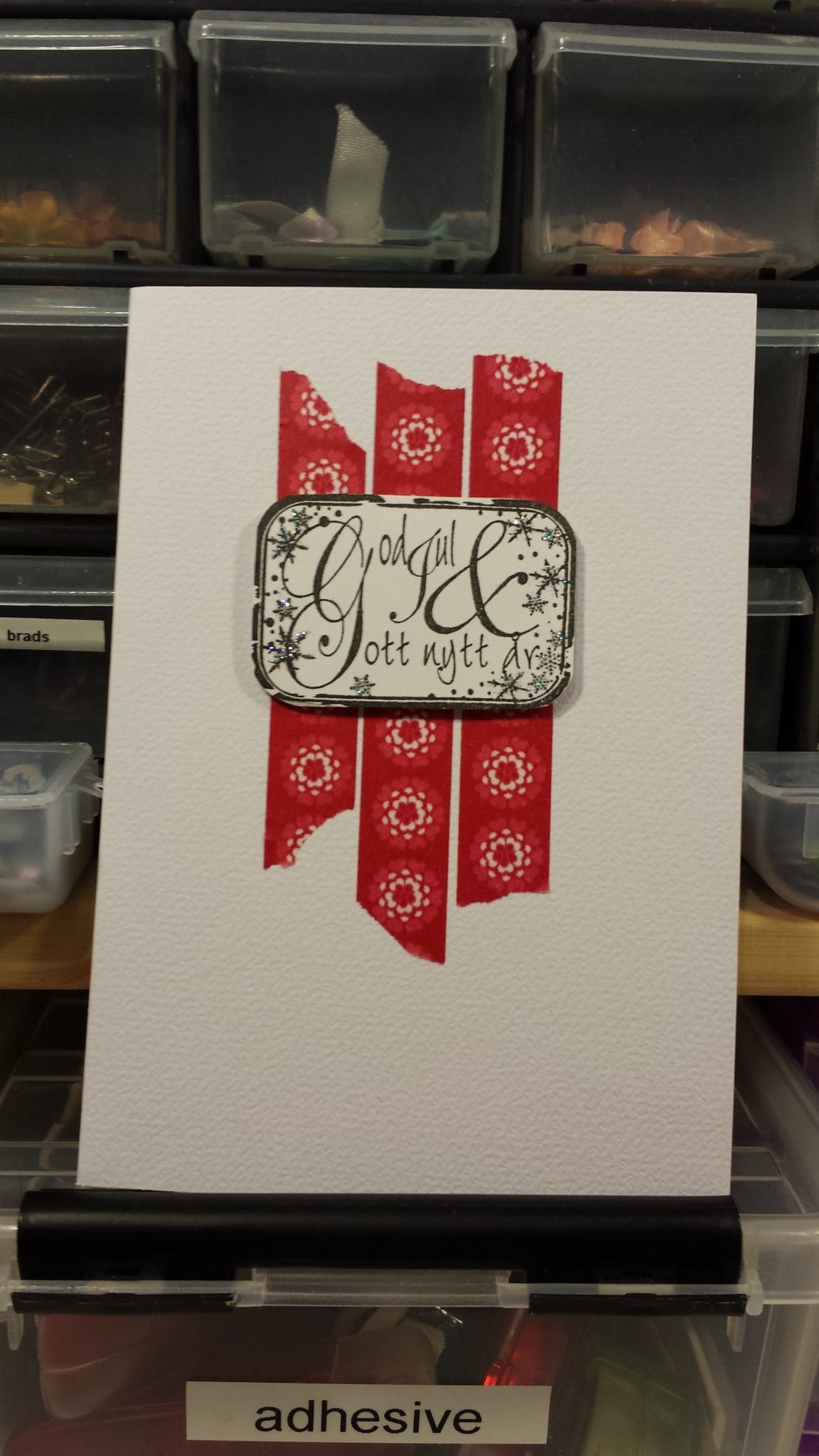
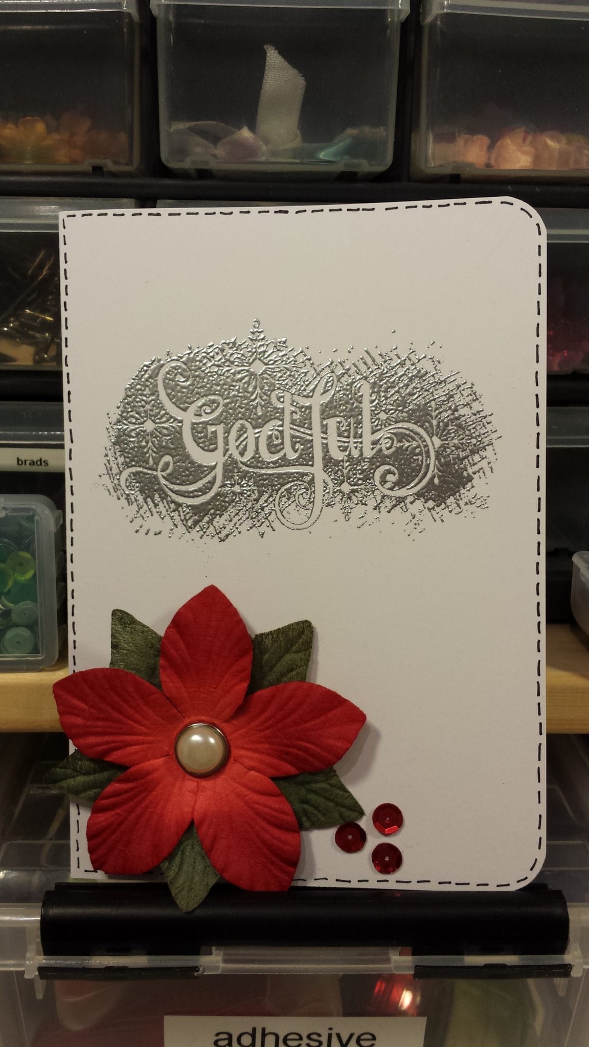
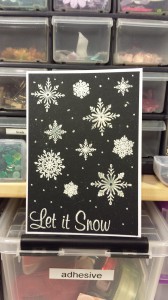
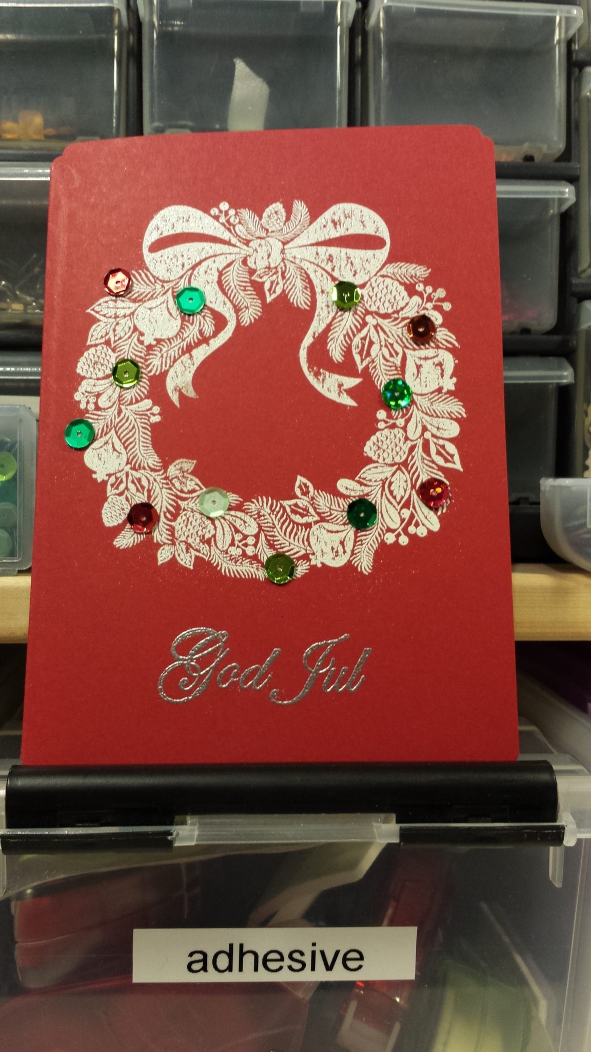
So here are the cards, some of them are made inspired by challenges which I will name and link below each image. I might edit and update this post tomorrow to make it a bit more interesting and informative.

Sorry for the terrible lightning, the sun sets so damn early this time of the year.

cc2013-1cc2013-5
Mojo Monday #323

cc2013-2

Bildmålarna December challenge

 cc2013-3


 cc2013-4

Freshly made sketches #116

 cc2013-6


 cc2013-7


 cc2013-8

CFC Challenge #123: Let it snow

 cc2013-9 cc2013-10
 cc2013-11


 cc2013-12

Fab Friday #33: a sketch
Magnolialicious challenge: doilies

 cc2013-13

I love promarkers #198: follow that sketch

 wpid-20131215_220425.jpg


A colorful birthday card

I made another birthday card today, inspired by this week mojo monday challenge #299

I looked through my paper stash and found this icecream patterned paper from echo park which I’ve owned for years and never used. It was time!

I wanted the card to look like summer so I went for bright and happy colors, I could have used brighter/lighter colors on the gifts but I wanted it to bring out the blue and green colors from the background since the other details were pink, orange and yellow. I colored the flower with my dylusion spray london blue and added some pearl mist to lighten up the color a bit, and to add some shine of course! I might add some stickles to the stamp, I haven’t really decided yet.

The yellow ribbon is another thing that has been lying in my stash for ages, I’m not really a fan of yellow but I’m working on it on all levels, just got myself a yellow summer dress!

image

image

A birthday card

I always make my masculine cards very dark I’ve noticed, not sure why. I guess my next challenge will be to make a bright masculine card, hehe. I made this for my stepfather but I might make a new one with another theme. Now I have one as a backup if I don’t get the time to make him a second card.

I was inspired by this week’s Fab Friday sketch! I went for some matching colors from  a few of my bo bunny papers I’ve sliced into 6×6’s. I added some gloss to the bike but it doesn’t show properly on the image below, and I used some stickles on the arrow to make the card a bit more fun. I had a hard time choosing the color of the card base.. white, grey or brown? I thought the brown brought the colors to life more than the white base, the grey one just made the card very meh.

The stamp is colored with pencils! That was a loooong long time ago and the only reason is me being lazy. I stamped the bike on a paper that bleed and I was too lazy to redo it on a proper piece of paper :-)

I did another rookie mistake and assembled the card before I had the sentiment stamped so I stamped on the card when almost finished! First I was going to put his age in the circle but I realized that I’ve done that for the last 10 birthday cards so I had to rethink.

image

 
image

Another 50th birthday

My mom asked me to make her another card for another friend who just turned 50.
I decided to use this stamp which I haven’t really got to use yet, I’ve just been practicing coloring and waiting for the perfect moment to use it!
The pink paper was one of the first things I decided to use for this card and my plan was to use it as a background or at least use it for a large piece, I wanted it to be a main part of the card. Today when I assembled the card it was just too much with the pattern and all the colors (I decided to go for the I love promarkers challenge this week which is the color combo blue and pink). I wanted more white space. So I decided to just keep a stripe at the bottom and some decorations in blue and pink. All the flowers and the butterfly are sprayed with pearl mist and some color mist or distress stain to make them more interesting, plain colored flowers are often quite boring and the nuance wasn’t what I was looking for either. Luckily my distress stain broken china and spun sugar was just perfect together with the Plain Jane simply sheer spray Rosey. I also added some stickles on the stamp and the butterfly and a few too many rhinestones. These are, however, just taking up space in my stash so I was very happy to use them! And since the theme of the daring cardmakers challenge this week is forgotten treasures, I just had to add a few more and some paper flowers too!
I’m not completely satisfied with the card, I find it a bit too much. I should have left more white space and skipped the tag plus some of the bling, but you live and you learn, next time!
image

image

image

25th birthday card

One of my cousins turns 25 in a few weeks and I made this card for her. Her favorite colors are red, black and white (if I recall correctly), she also likes stars and to make movies. I know she wouldn’t appreciate a girly card and I’m not sure I like how masculine this card looks but at least it has some glitter, that’s not very masculine, right?

The card was inspired by this week’s Mojo Monday Challenge #296

image

Mother’s day

I made a card for my mother for mother’s day here in Sweden, it’s celebrated a few weeks later than in most countries in the world.

I used the current Mojo Monday challenge for the layout. My mom loved it!

image

The stamp says “To my beloved mother” in Swedish.

image

The collecting matching papers work and results!

image